There are 800 students enrolled in four allied health programs at a local community college. The percentage of students in each program is displayed in the pie chart. Which of the following is the number of students enrolled in the respiratory care program?
A. 336
B. 152
C. 144
D. 168
100% represents total students four allied health program. Thus, 100%=800 students, and 19% joins respiratory care program is

Thus, 152 students joined the respiratory care program.
Therefore, the Correct Answer is B.
More Questions on TEAS 7 Math
-
Q #1: A consumer recently purchased a new car and paid $48,000. This amount is $2,000 less than twice what the consumer’s friend paid for their car. Which of the following is the amount that the friend paid for their car?
A. $23,000
B. $46,000
C. $25,000
D. $50,000
Answer Explanation
Let the amount the friend pays be x. Then, 2 times what the friend pays is 2x. Less $2,000 what the friend pays is 2x-2000.
Now we know that
2x-2000=48000
Add 2000 to both sides of the equation
2x-2000+2000=48000+2000
2x+2000-2000=50000
2x=50000
Divide both sides by 2
X=25000
Thus, the friend pays $25,000 for their car.
-
Q #2: (x/y)-z=rw Solve for x in the equation above.
A. X=y(z+rw)
B. X=rw(y-z)
C. X=rwy+z
D. X=rwy-z
Answer Explanation
Given the equation (x/y)-z=rw, we make x the subject of the formula as follows:
(x/y)-z=rw
Add z to both sides of the equation
(x/y)-z+z=rw+z
(x/y)=rw+z
Multiply both sides by y
(x/y)*y=y(rw+z)
X=y(rw+z)
Rearranging the equation results in:
X = y(z+rw)
-
Q #3: A teacher asked all the students in the class which days of the week they get up after 8 a.m. Which of the following is the best way to display the frequency for each day of the week?
A. Histogram
B. Pie graph
C. Bar graph
D. Scatter plot
Answer Explanation
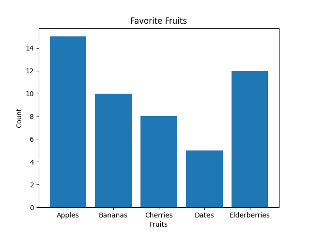
The best way to display the frequency of each day of the week when students get up after 8 a.m. is by using a bar graph. Bar graphs are well-suited for representing categorical data, where each day of the week is a separate category, and the height of each bar corresponds to the count or frequency of students waking up late on that specific day.
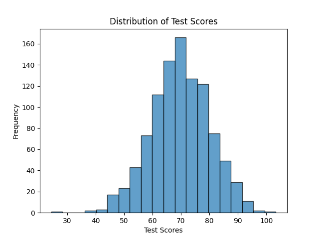
Note: Histograms, on the other hand, are more appropriate for visualizing continuous or numerical data and are not ideal for categorical data like days of the week. Histograms are useful for understanding the distribution of data, identifying patterns, and assessing the shape of the data distribution, such as whether it's normally distributed, skewed, or has multiple modes.
As you can see below, the Histogram is used to depict a pattern/continuous/range data. While a bar graph does just fine even with discrete data.