/

A sweater that normally sells for $87 is marked 25% off. Which of the following estimates the sale price of the sweater?

A. $51

B. $36

C. $22

D. $65

Answer Explanation:

: we are to find the selling price of the sweater after subtracting the mark off price.

Mark off value=mark off rate*original price

Mark of value=25%*$87

We convert 25% into a fraction, which become 25/100=0.25. Then

Mark of value=0.25*$87=$21.75

The selling price of the sweater will be the original price less the mark off value. Then,

Thus, the approximate selling price of the sweater is $65.

Therefore, the Correct Answer is D.

More Questions on TEAS 7 Math

  • Q #1: An athlete runs 4 miles in 28 minutes and then changes their pace to run the next 4 miles in 32 minutes. Overall, what is the average time in minutes it takes the athlete to run 1 mile?

    A. 7 minutes

    B. 8 minutes

    C. 7.5 minutes

    D. 8.5 minutes

    Answer Explanation

    to find the average time the athlete runs in 1 mile, find total time divided by total distance covered.

    Total distance=4+4=8 miles

    Total time=28+32 =60 minutes

    From the above, the athlete runs 8 miles in 60 minutes, so the athlete will take how minutes to cover 1 mile.

    So, the athlete covers 1 mile in 7.5 minutes.

  • Q #2: A teacher has asked all the students in the class which days of the week they get up after 8 a.m. Which of the following is the best way to display the frequency of each day of the week?

    A. Histogram

    B. Scatterplot

    C. Pie graph

    D. Bar graph

    Answer Explanation

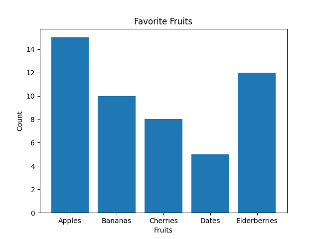
    The best way to display the frequency of each day of the week when students get up after 8 a.m. is by using a bar graph. Bar graphs are well-suited for representing categorical data, where each day of the week is a separate category, and the height of each bar corresponds to the count or frequency of students waking up late on that specific day.

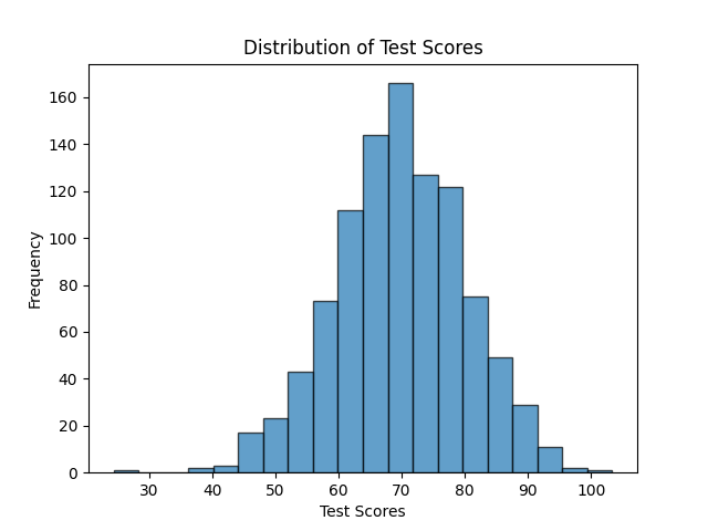
    Note: Histograms, on the other hand, are more appropriate for visualizing continuous or numerical data and are not ideal for categorical data like days of the week. Histograms are useful for understanding the distribution of data, identifying patterns, and assessing the shape of the data distribution, such as whether it's normally distributed, skewed, or has multiple modes.

    As you can see below, the Histogram is used to depict a pattern/continuous/range data. While a bar graph does just fine even with discrete data.

  • Q #3: Which of the following values is the greatest?

    A. 9/2

    B. 4.4

    C. 10/3

    D. 4.25

    Answer Explanation

    The initial step is to convert the decimal numbers into fractions.

    4.4 becomes 44/10

    4.25 becomes 425/100

    Thus, the set of fractions is 9/2, 44/10, 10/3, 425/100. The least common denominator for 2, 10, 3, and 100 is 300, which we use to compare each options given.

    9/2*300=1350

    44/10*300=1320

    10/3*300=1000

    425/100*300=1275

    From the above, 1350 is the greatest value which corresponds to 9/2. Thus, 9/2 is the greatest value of all the choices given.