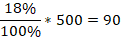
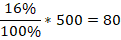
A survey of 500 teenagers was taken to see which sport was the favorite to watch on television. The pie chart above represents the results. Which of the following data sets (number of teenagers) was used to develop the pie chart?
A. Basketball, 120: football, 190: hockey, 90: soccer, 80: other 20
B. Basketball, 120: football, 190: hockey, 80: soccer, 90: other 20
C. Basketball, 190: football, 120: hockey, 90: soccer, 80: other 20
D. Basketball, 240: football, 380: hockey 160: soccer, 180: other 40
The whole pie chart represents 100%, which we use together with the given percentages to find the respective different sports. Note that 100% is equal to 500 surveyed students. The, the number of teenagers who prefer:
Soccer
Hockey
Football
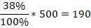
Basketball
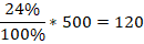
Other
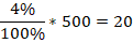
From the evaluations above, 90 teenagers love soccer, 80 love hockey, 190 teenagers love football, 120 teenagers love basketball, and 20 teenagers love others.
Therefore, the Correct Answer is B.
More Questions on TEAS 7 Math
-
Q #1: A local law school reports that 74% of last year's graduates are employed by law firms, 3% work for the government and 2% work for nonprofit organizations. The rest of the graduates work at jobs unrelated to law. Based on these outcomes, which of the following is the percentage of graduates working jobs unrelated to law?
A. 5%
B. 79%
C. 69%
D. 21%
Answer Explanation
Percentages always add up to 100%. If we let x be the percent of graduates working for jobs unrelated to law, then
74%+3%+2%+x=100%
79%+x=100%
Subtract 79% from both sides of the equation
79%-79%+x=100%
x=100%-79%
x=21%
So, the number of graduates working for jobs unrelated to law is 21%.
-
Q #2: If the trend below continues, which of the following is the best estimate of the average price of a home in 2016?
A. $155,000
B. $120,000
C. $125,000
D. $140,000
Answer Explanation
Looking at the given trend, it is observed that the price increases with years. From 2008 to 2012, the price is fairly constant but we expect it to be more than $130,000 in the year 2016. The expected price in 2016 is $140,000.
-
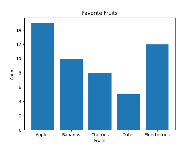
Q #3: A teacher has asked all the students in the class which days of the week they get up after 8 a.m. Which of the following is the best way to display the frequency for each day of the week?
A. Pie graph
B. Bar graph
C. Histogram
D. Scatterplot
Answer Explanation
The best way to display the frequency of each day of the week when students get up after 8 a.m. is by using a bar graph. Bar graphs are well-suited for representing categorical data, where each day of the week is a separate category, and the height of each bar corresponds to the count or frequency of students waking up late on that specific day.
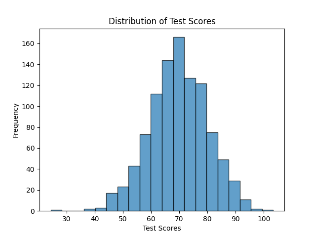
Note: Histograms, on the other hand, are more appropriate for visualizing continuous or numerical data and are not ideal for categorical data like days of the week. Histograms are useful for understanding the distribution of data, identifying patterns, and assessing the shape of the data distribution, such as whether it's normally distributed, skewed, or has multiple modes.
As you can see below, the Histogram is used to depict a pattern/continuous data. While a bar graph does just fine even with discrete data.