A farmer is planning for a growing season and want to know the trend in amount of rainfall in his area. He obtains rainfall falling in the first 5 months of the year as shown in the above table. Which of the following would best display the data? Month January February March April May Rainfall (mm) 20 6 14 28 34
A. Scatter plot
B. Pie chart
C. Line graph
D. Bar graph
Based rainfall falling for the first 5 months, a bar graph will give a great display for the farmer to decide when start planting. The horizontal scale will represent months of the year and vertical scale will present the amount of rainfall falling.
Therefore, the Correct Answer is D.
More Questions on TEAS 7 Math
-
Q #1: How may milliliters are there in 2.5 liters?
A. 0.25
B. 250
C. 25
D. 2500
Answer Explanation
We use 1 L =1000 mL to convert between the two units. The conversion options of interconversions are:

And

We want millimeters, use the second option to change L to mL as:
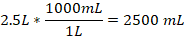
Therefore, 2.5 L is equivalent to 2500 mL.
-
Q #2: How many yards are in 27 feet?
A. 3 yards
B. 18 yards
C. 6 yards
D. 9 yards
Answer Explanation
Here we convert between feet and yards. We know 1 yard =3 feet. Then, 27 feet to yards will be:

Thus, 9 yards is equal to 27 ft.
-
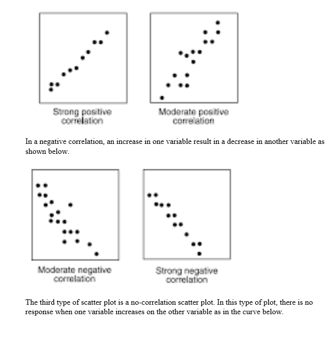
Q #3: The scatter plot below shows the relationship between the number of hours a student plays golf and the student’s class attendance. Which of the following types of correlation is shown on the scatter plot?
A. Positive
B. Positive and negative
C. No correlation
D. Negative
Answer Explanation
Scatter plots can depict three correlations: positive, negative and no correlation. A positive correlation scatter plot reveals that as one variable increases, the other variable also increases as shown below